Schneider Electric
From enterprise buyer to everyday homeowner

ROLE
Product Design Intern
TIMELINE
Jun 2025 - Aug 2026
TEAM
Digital Customer Relationship Team
SKILLS
Product Design
User Research
Stakeholder Management
Curious about the deeper processes with this case study? Check out my , or shoot me an email!
Chris-generated Overview
2025 @ Schneider Electric
Over the 2025 summer, I interned in Boston with Schneider Electric's Digital Customer Relationship Team, collaborating with partners across France, Spain, and the U.S. Together, we launched their first global E2E B2C web experience for homeowners.
My focus was product discovery, the stage where users were dropping off before reaching the checkout. Through competitive benchmarking, heatmap analysis, and heuristic audits, I redesigned the filter system, product taxonomy, and product cards, reducing the journey steps by 33%. Benchmarking data shows comparative converstion lifts of nearly 6% and returns of 75:1.
I had the pleasure of working with Chris during his 10-week internship on our B2C Web Experience projects, and he quickly proved himself to be an invaluable contributor.
He brought fresh perspectives, strong attention to detail, and an impressive ability to translate ideas into clear, practical outputs in Figma. Chris not only supported design work but also provided thoughtful recommendations that improved out user experience approach.
His curiosity, professionalism, and collaborative spirit made him a great addition to the team.
~ Oz Hassan, Director of Digital Transformation & Strategic Communications
BostonHub DCR Team!
CONTEXT
From enterprise buyer to everyday homeowner
Schneider Electric is a global leader in energy management and automation. Their ecosystem was built for enterprise buyers. But the market shifted. A PWC report found that:
80-90%
B2B buyers expect B2C experiences
73%
buyers say the UX matters as much as product
49%
consumers say companies have a good UX
Competitors like Siemens, Eaton, and Legrand were already investing in cleaner storefronts and consumer-friendly journeys. SE responded by launching their own B2C experience, letting homeowners browse, interact with AR, and find nearby retailers.
PROBLEM
Reducing browsing friction
As I worked in the CMS and ran heatmap analysis in parallel, friction points kept surfacing in product discovery. The experience was consumer-facing, but the conventions users rely on to orient themselves were not there.
3 Step Filtering
Open, select, apply pop-up method. No iterative feedback or visible change.
Unclear Hierarchy
106 options with no real hierarchy and poor grouping. Immediate cognitive load.
Product Layout
Huge card real estate, yet no details, leading to low confidence browsing.
FRAMING SUCCESS
Connect user problem to business outcome
Looking at all the filtering friction, I synthesized the definition of success to frame it in a way that connected the user problem to the business outcome. Confidence is the missing ingredient to the stew, just orient someone so that they have enough control to find what they need.
By enabling homeowners to browse and discover products with confidence, Schneider Electric can reduce drop-off rate at the discovery stage and ultimately convert a first-time visitor into a buyer.
RESEARCH
Pattern Alignment
Looking at our competitors through benchmarking to contextualize best practices, I found that most use left-aligned filter panels. They are common and exist for a reason. They stay visible as your scroll, are adjustable without losing context, and do not involve pop-ups to refine search.
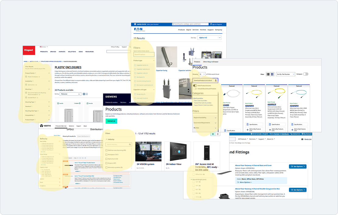
Competitors similarly utilizing filter panels
What are the returns on this UI pattern?
Fully is a D2C furniture brand that went through a filtering redesign. When they implemented a filter panel to create a clearer journey, it resulted in a 5.97% conversion lift. What's even more compelling it that got a 75:1 ROI from this project with the agency. If they spend 10k, they get 75,000 DOLLARS BACK. SE with their wide cast net can see even more with this implemented.
FINAL DESIGNS
With my findings in hand, I moved into solutions. I worked with my senior designer mentors throughout this process to pressure-test decisions against the design system. I presented this to my director, 2 VPs, engineers, and the regional representations from France and Spain whom I collaborated with.
FOCUS REDESIGN AREAS
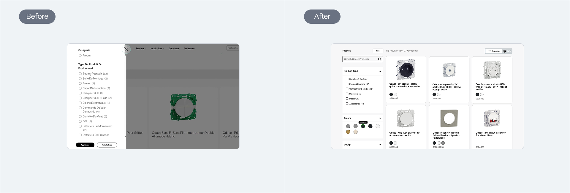
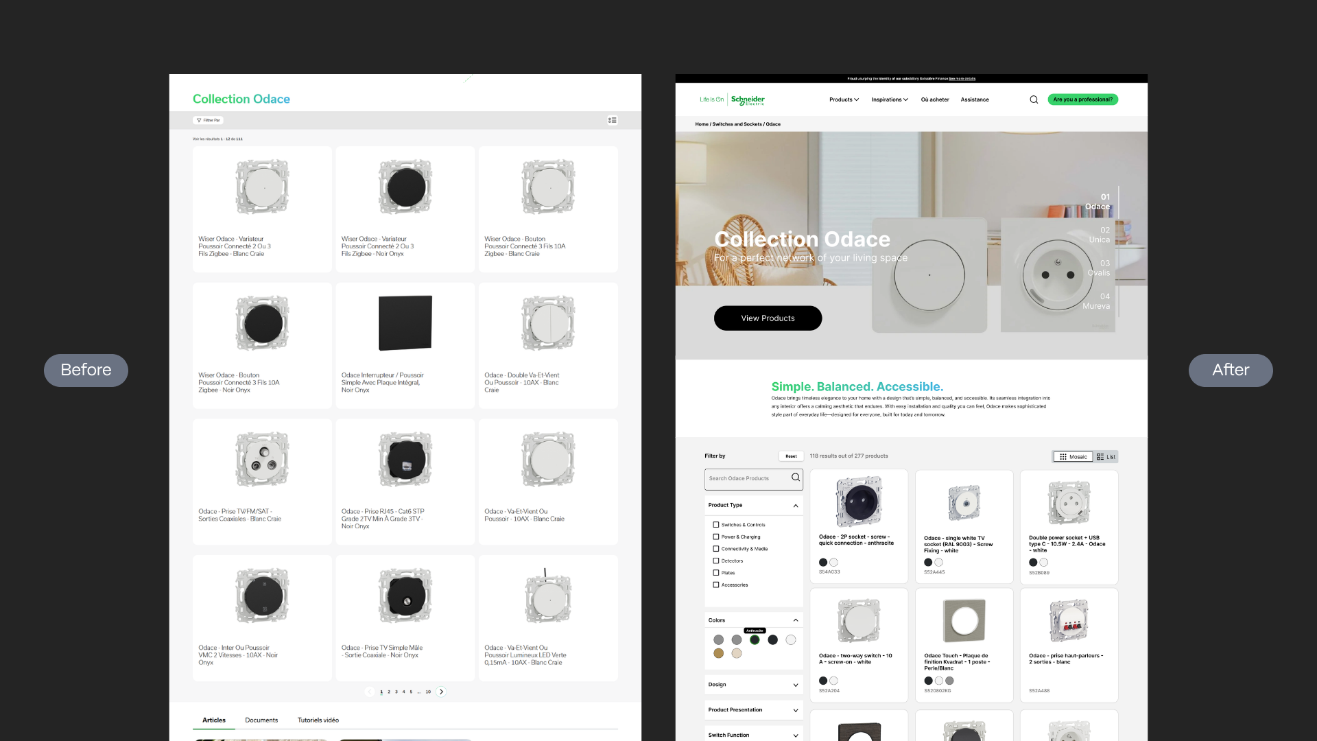
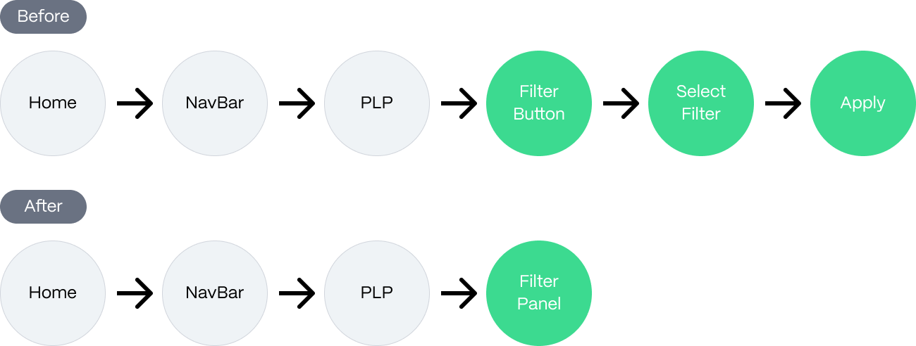
Previous 3 Step Pop Up flow replaced with persistent filter panel anchored to left side. Gives users more control and a significant decrease in drop-off rates at the stage where people would leave before reaching a product.
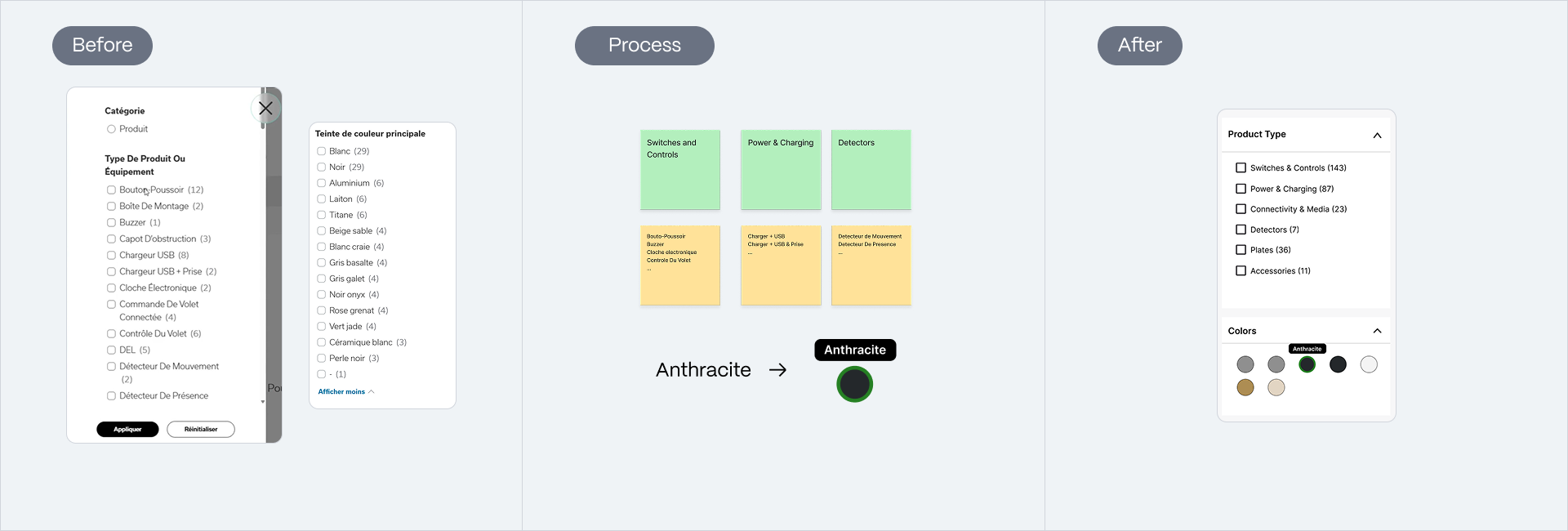
106 flurried options were card sorted into product types, along with color options switched to visual swatches, promoting recognition over recall.
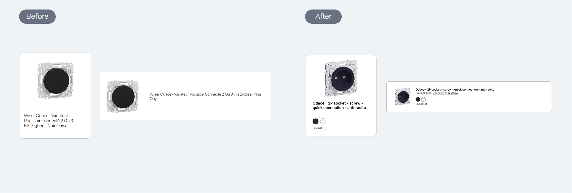
Product cards have more information, where homeowners can now make preliminary decisions, leading to more confident browsing.
IMPROVED JOURNEY FLOW
Effective browsing
From the position of a homeowner starting from the homepage, it required a minimum of 6 discrete steps to reach a filtered set of products on PLP. Now, it is 33% less steps. That is 33% fewer moments someone can losing their footing, and more time to find something worth buying.
OUTCOME
Currently in development!
If I had more time during my internship, I would test the design with A/B and look at statistics for its effectiveness. There's also opportunities to continue at the E2E system areas. Working in a complex environment, tight timelines, and a big stakeholder room, my project was green-lit for development!
REFLECTIONS
What I learned
Think holistically
Recognizing that fixing individual pain points was not enough, the entire flow needs to work together in harmony.
Business goals don't always conflict user needs
They can reinforce each other. Removing barriers for users also removes barriers to conversion growth.
