WPI Global Research Data Platform
Unite all data methods into one platform
ROLE
Designer & Developer
TIMELINE
May 2024 - Oct 2024
TEAM
Hunter Poulin
James Walden
Nate Schneider
Gus Montana
SKILLS
Product Design
Front-end Development
UXR & Testing
Curious about the deeper processes with this case study? Check out my , or shoot me an email!
Chris-generated Overview
One home for Global IQP Research
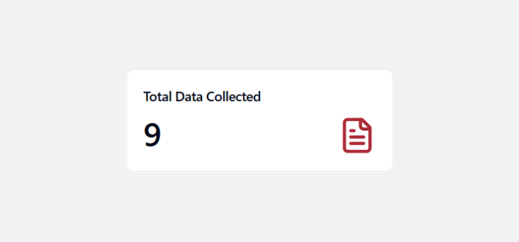
Our team delivered the IQP Data Collection Tool: a unified workspace for interviews, surveys, and field data for 1,200+ students across 50+ global project sites. I led product design and frontend development, including 30 usability sessions, shipping a PERN stack application with offline storage, geotagging, and AI-assisted transcription. After user testing, we presented to the WPI President and Global School Dean, and the application was officially integrated into WPI's servers, putting it in reach of the full student population annually!
CHALLENGE
No playbook. No system. Figure it out.
Imagine landing in a country you've never been to, with 8 weeks to deliver real research, but there is no system for how to collect, organize, or store any of it. IQP teams improvise, stitching together platforms that don'talk to each other. The most critical weeks of the project get quietly eaten up by logistics, not research.
Lots of context switching, data fragmentation, and export/compatability issues between platforms.
USER RESEARCH
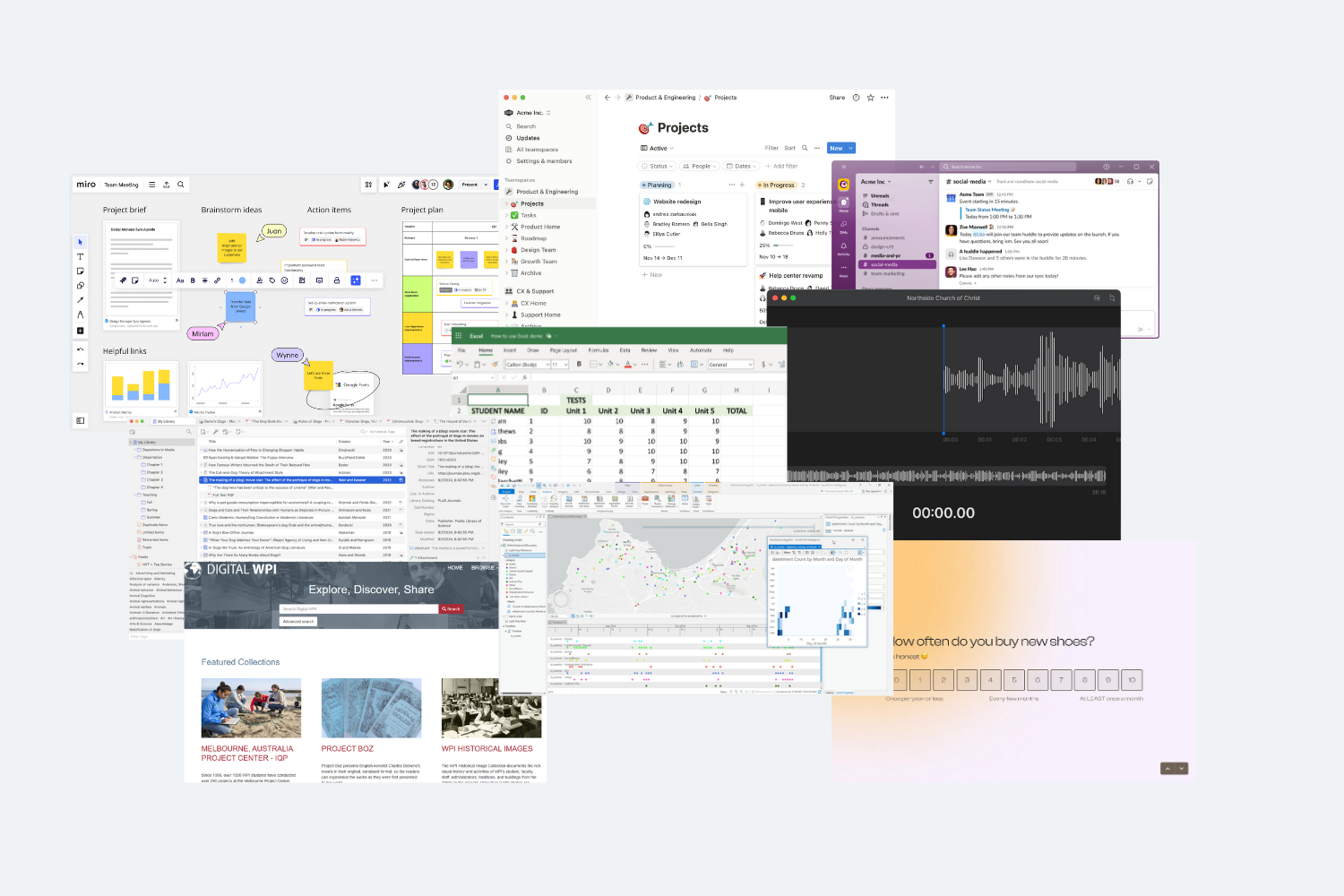
Student Needs & Competitive Analysis
We took a three-pillar approach to understand our student needs and validate our direction.
Prioritization
Analyzed 20 IQP papers to identify common data collection methods, guiding sprint feature prioritization.
Viability
Existing tools were costly, had complex UIs, and were designed for enterprise industries, not students. This validated our opportunity for a free, student-tailored solution.
Revitalization
Using existing WPI digital foundations allows a natural extension of the ecosystem.
Solution
Create a unified platform that standardizes data collection tostreamline project workflows andeliminate logistical overhead.
Using a PERN stack application, we aimed to eliminate the base logistical overhead and empower our fellow students to focus on what matters most: solving real world problems.
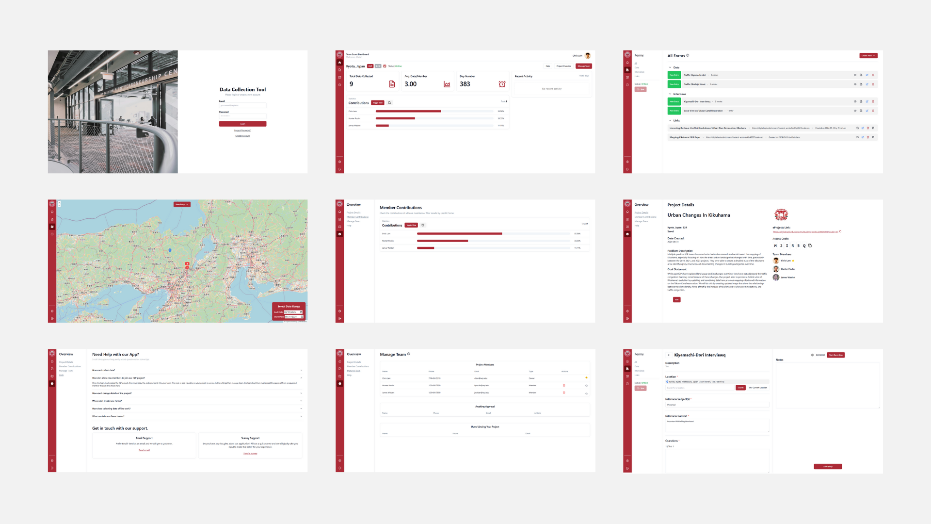
Key Expected Features
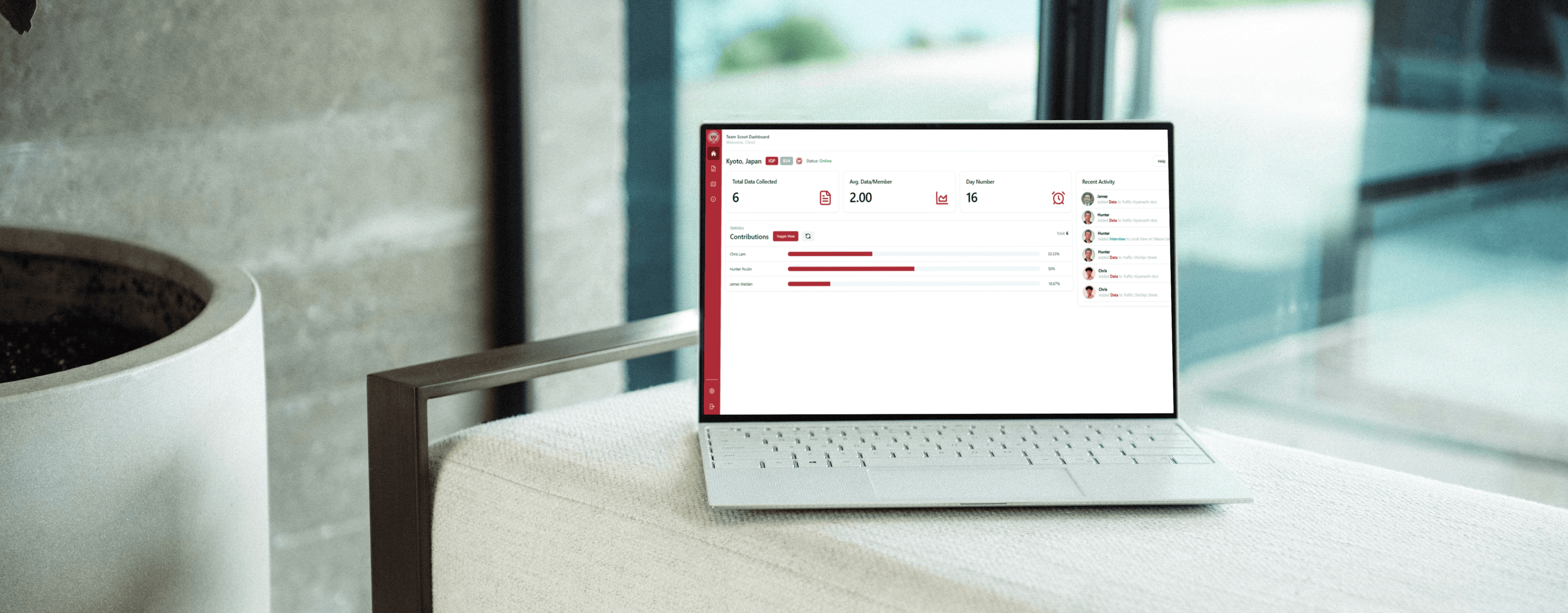
Team Dashboard
Manage team contributions and data.
Geotagging
Data entries are geotagged onto map for location context.
Offline Usage
Data linked to local storage when outages occur.
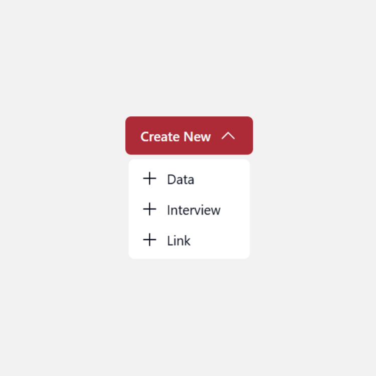
AI Forms
Dynamic form building and AI assisted interviews.
User Flows
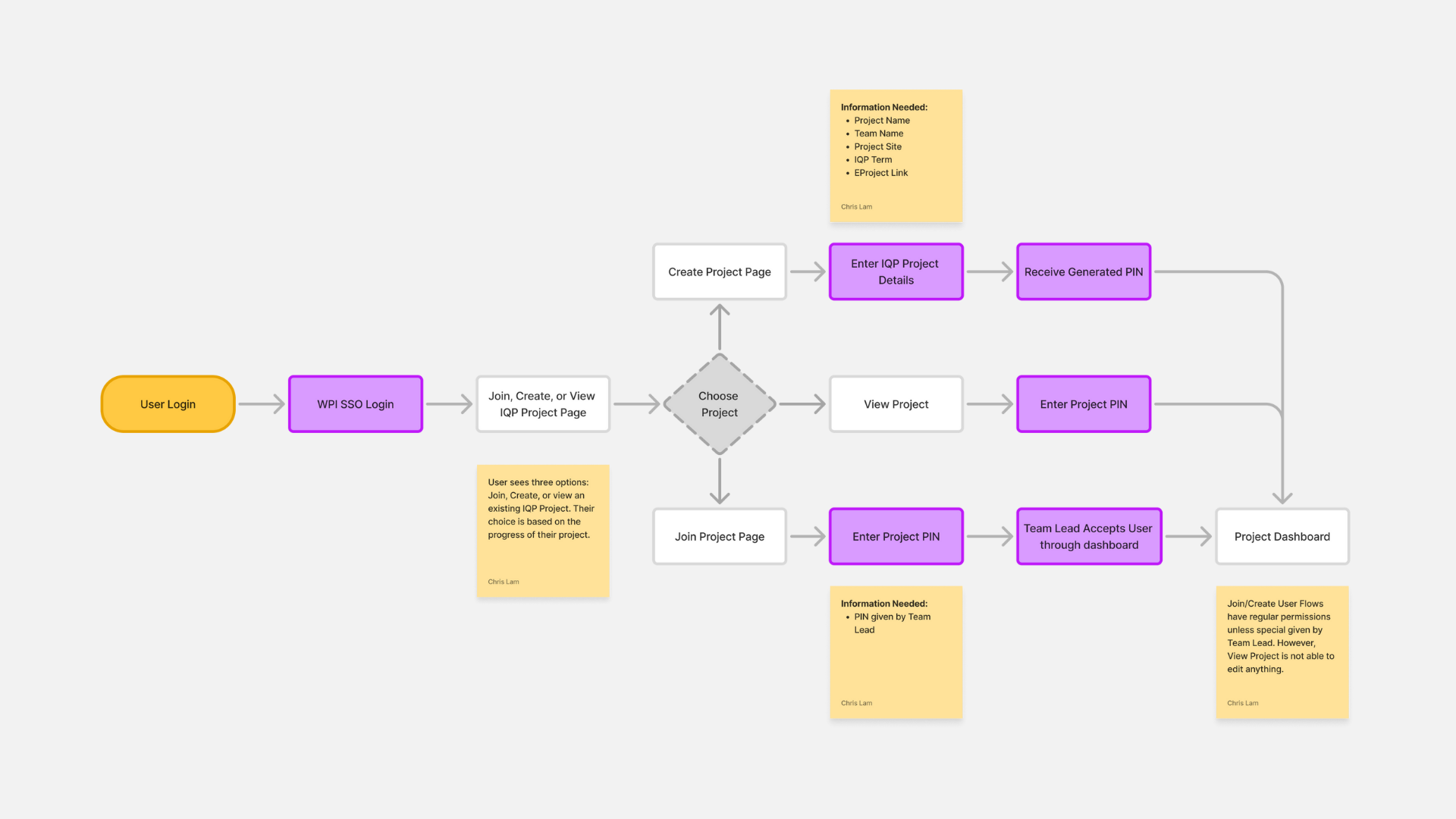
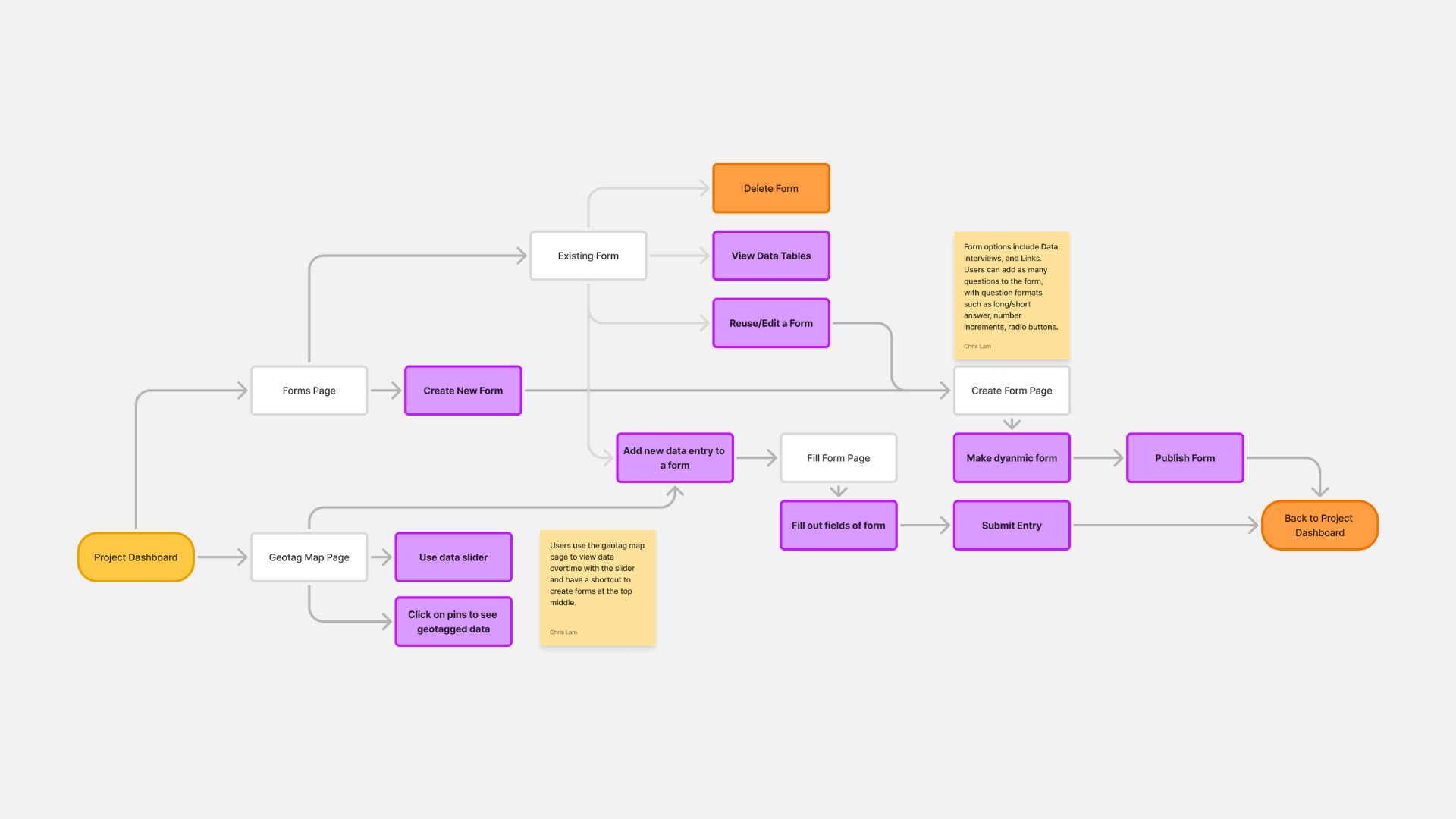
Onboarding & Platform
The platform features two core flows: onboarding (SSO login to project setup with role-based permissions) and data collection (form creation to map visualization with flexible access points).
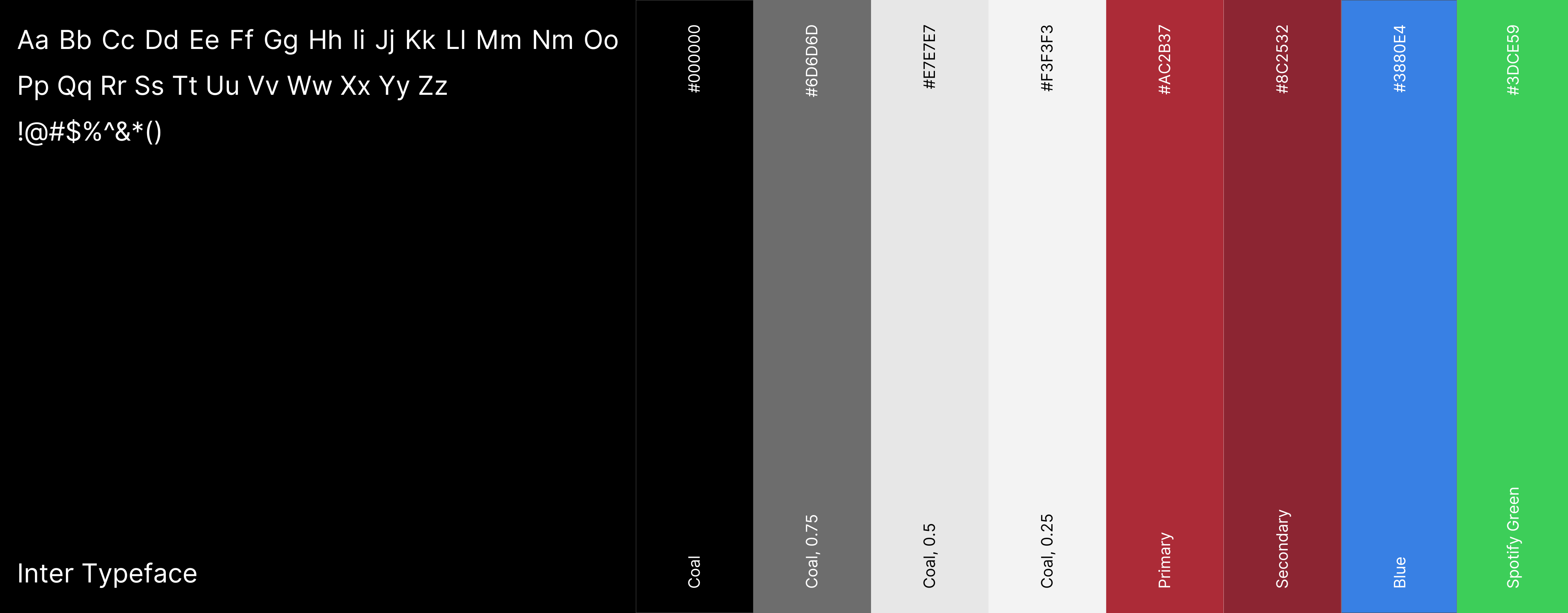
DESIGN SYSTEM
The design system of the IQP DCT serves as a visual bridge between WPI's existing interfaces and a refreshed, modern aesthetic from shadcn. By blending in familiarity with modern minimalist principles, we ensure consistency across the platform while introducing a cleaner and more intuitive student experience.

DESIGN ITERATIONS
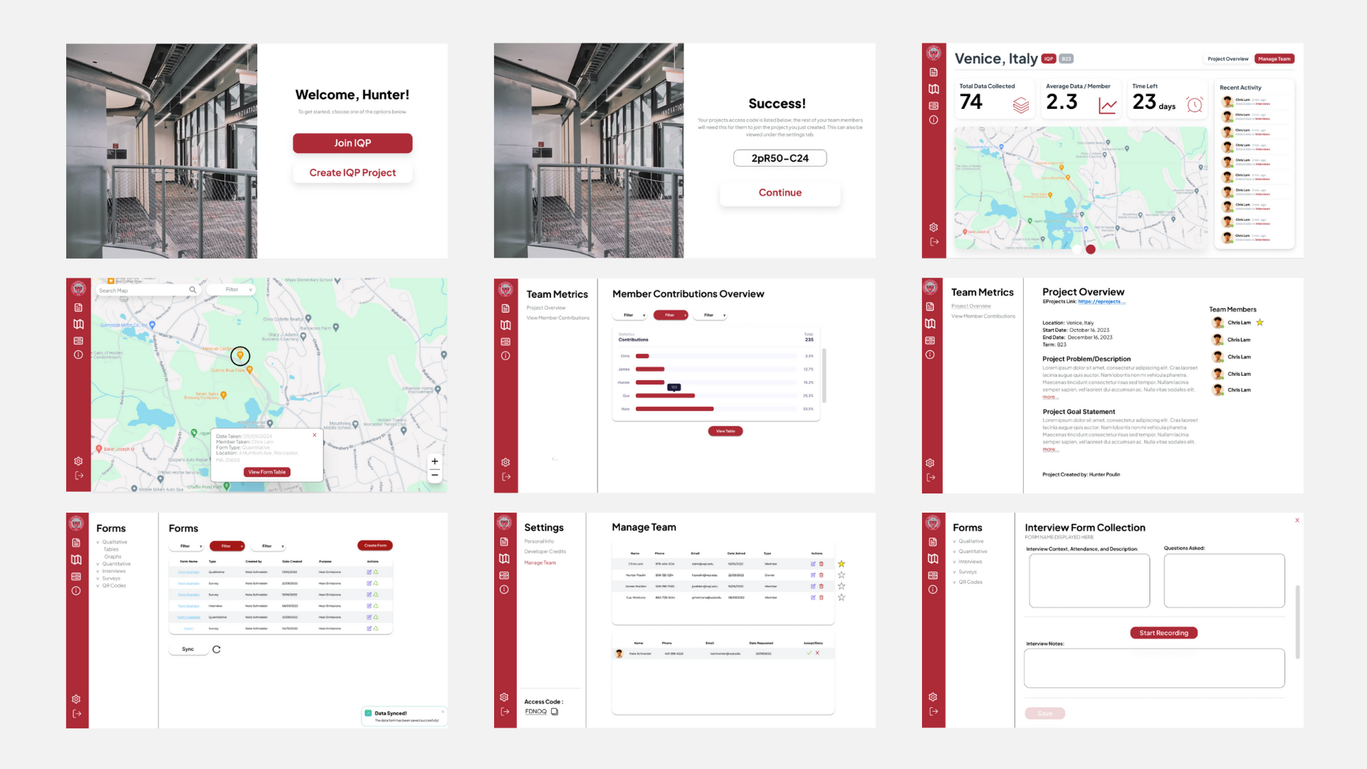
After defining the design system, initial mockups visualized basic layouts for forms, dashboards, and onboarding. With the team unfamiliar with Figma and shadcn's design system, early mockups reflected a learning curve but provided valuable direction for the application's structure.
Before
Iterative User Testing
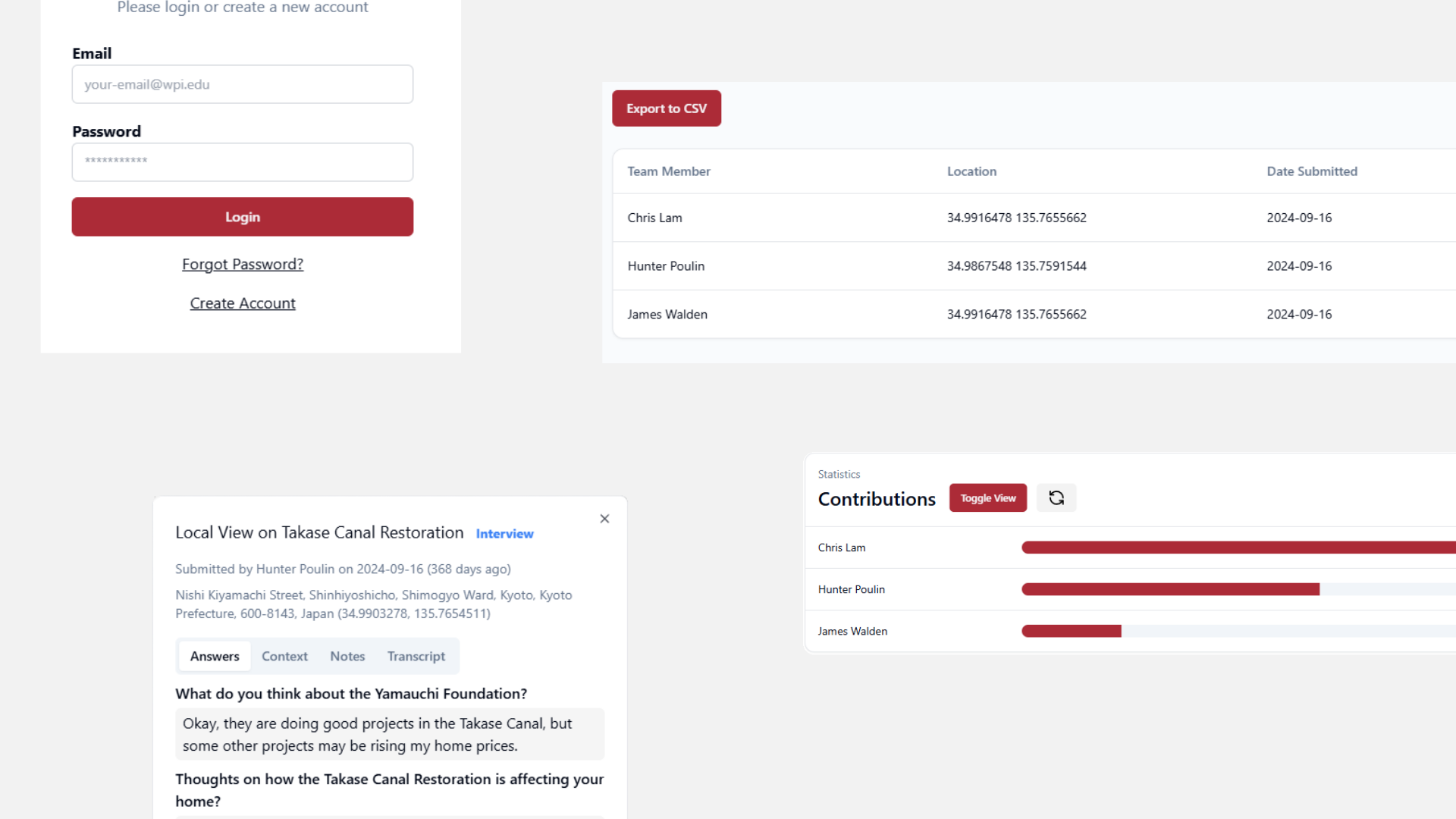
With a functional full-stack prototype, we conducted 30 user testing sessions over 3 weeks (10 per week) with students and faculty. This iterative approach revealed critical usability issues and validated design decisions, with most actionable feedback emerging in the first two weeks.
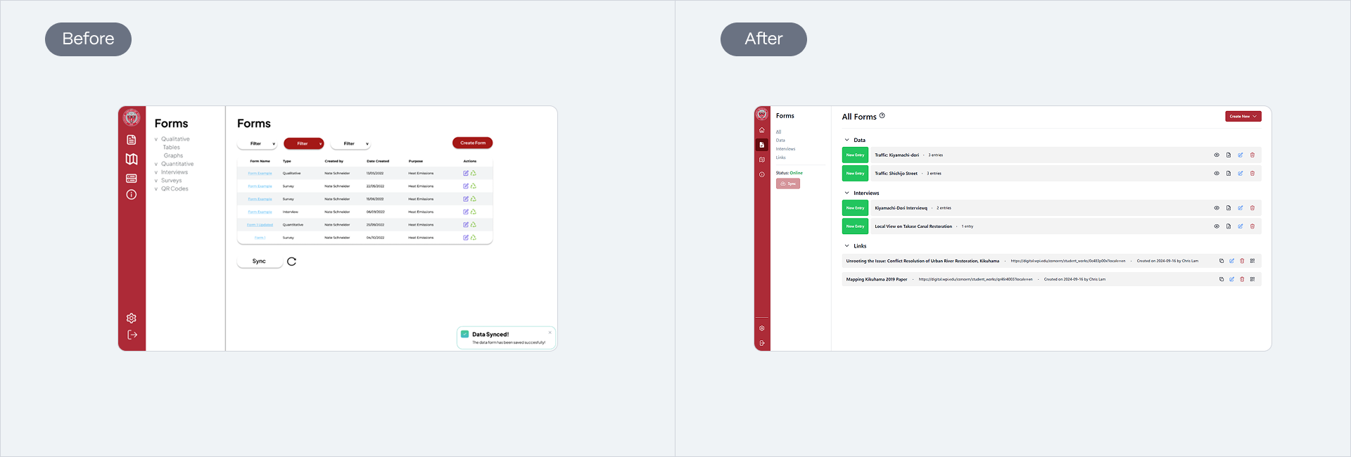
The original forms flat table buried forms in click depth, so we restructured how students actually worked from start to finish in task flow: collapsible accordion groups with entry counts and actions visible.
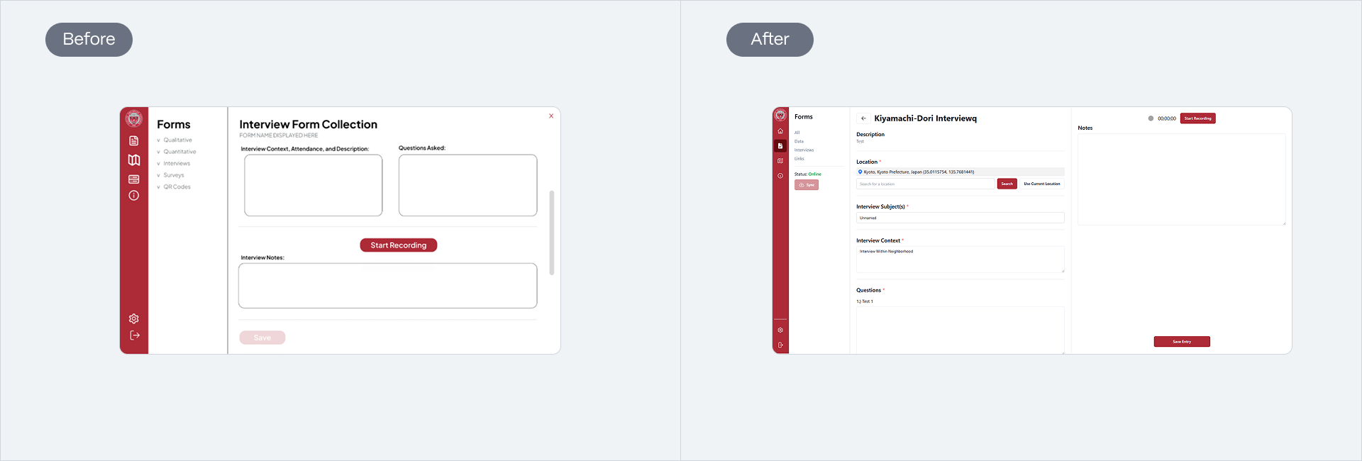
Interview process literally had no IA structure. There is now 2 panels with structured fields on the left, and AI-assisted recording and notes on the right for separate context and multitasking abilities.
After
OUTCOMES
System-wide Integration
After a successful user testing session, we presented our solutions to the WPI President and Global School Dean. Our application was then officially integrated into WPI's servers, making it accessible to more than 1,200 students across 50+ project sites worldwide!
REFLECTIONS
What I learned
System Thinking
Frontend and design work closely together, and I understood the capabilities of each.
One UI component can change everything
What one component may work for one area may not work for another. Seeing what it out there based on research helps determine your pick.
