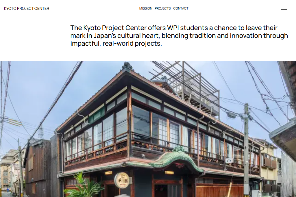
Kyoto Project Center
Kyoto IQP Database

ROLE
Designer & Developer
TIMELINE
Oct 2024 - Dec 2024
TEAM
Jason Zhang
Arjun Bhat
Szymon Mamro
SKILLS
Product Design
Front-end Development
Stakeholder Management
CHALLENGE
Dedicated Platform for Visibility
At Worcester Polytechnic Institute, students take part in the Interactive Qualifying Project (IQP), a hands-on unique humanitarian project conducted globally on respective sites. The Kyoto Project Center focuses on tourism and community dynamics, but lacked a platform to showcase its many projects. This gap created the need for a tailored website which reflects Kyoto's distinct identity.
IDEATION
Zen
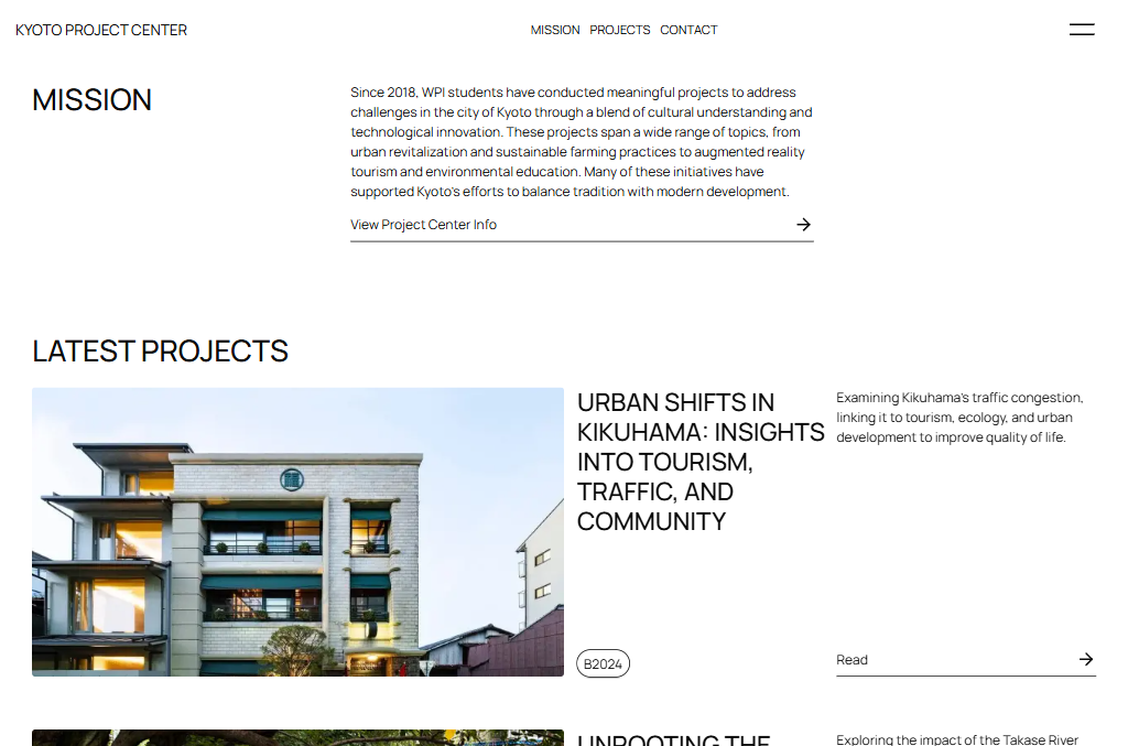
In crafting a website that reflects Japanese sensibilities, we embraced Zen principles to create an experience with cultural depth. Zen emphasizes mindful simplicity—removing distractions to highlight what matters most through clean layouts and intentional structure. Ample white space embodies "ma" (間), the meaningful pause between elements, allowing content to breathe and invoking calm. Standard black text ensures readability while supporting minimalist elegance.
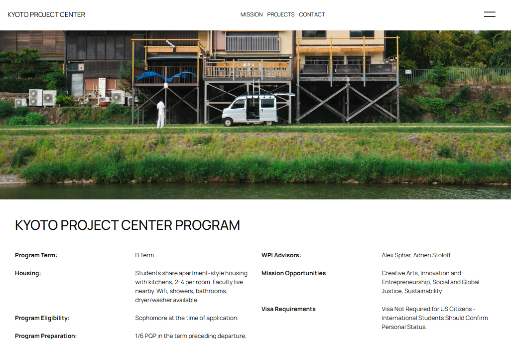
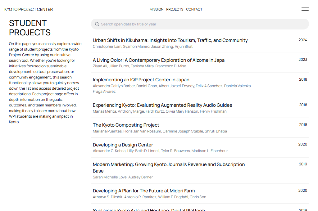
FINAL DESIGNS
REFLECTION
What I learned
Global stakeholder management
Working with different cultures challenges almost every bit of what you may consider to be okay.
Restraint in design
Not everything has to be there. Get what is important but have clarity in function.
